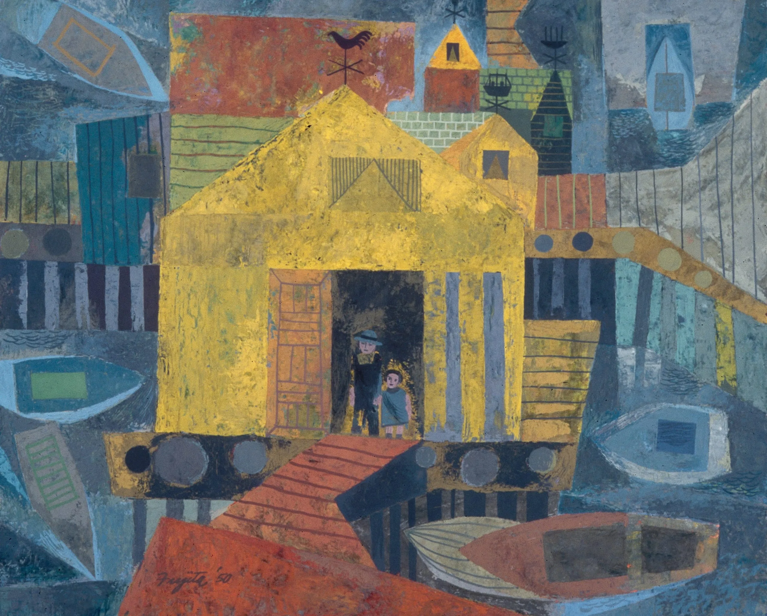
Harbor Living exemplifies the stylistic and technical changes that occurred in paintings exhibited in the California Water Color Society annuals during the late 1940s and early 1950s. Pure watercolor was sometimes replaced by more opaque mediums such as gouache and, as in this instance, tempera. No longer was the luminosity of the aquarelle desired, especially when the artist was concerned with design rather than representation.
Fujita presents a man and child looking out over a pier in a cluttered harbor. The viewpoint is high, the entire scene tilted up as if composed by a naïve painter, so that the essential shape of each object is easily discerned. Harbor Living is much more than a charming scene. The geometric shapes and lines are arranged with the same sophistication that marks Fujita’s book and graphic designs. The limited hues and values of the dull reds, terracottas, and gray-blues do not distract from the composition. The matte flatness of the tempera paint emphasizes two-dimensionality, and the brushwork activates the surface, enhancing the overall sense of liveliness.