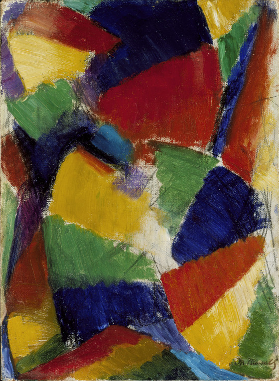
In the Paris showing of the synchromists at Galerie Bernheim-Jeune in 1913 Russell exhibited his first completely abstract synchromist paintings, this study and the much larger, final version, Synchro...
In the Paris showing of the synchromists at Galerie Bernheim-Jeune in 1913 Russell exhibited his first completely abstract synchromist paintings, this study and the much larger, final version, Synchromie en bleu-violacé, 1913 (Regis collection, Minneapolis). William Agee states that the study and the final version were both painted in the summer of 1913 between the synchromist exhibitions in Munich and Paris, although the germination of the painting actually began much earlier, as is documented in sketchbooks and oil sketches dating from 1912.
The composition moves around two curves -- an arc in the upper right and counter-curve in the lower left -- which Russell derived from the contrapposto pose of Michelangelo’s Dying Slave, 1513-16 (Louvre, Paris). Russell applied his pigment in pie shapes similar to the wedges that Bridgman had taught him were the essential shapes of a moving body. In a small booklet that he wrote to explain the painting (see Related Works), Russell described the movement as a "development in depth."
A basic tenet of synchromism is that the sensation of form in space can be created through the use of color. Russell was familiar with the late nineteenth-century color theories of Michel-Eugene Chevreul and Ogden Rood and had studied with the Canadian artist and color theorist Percyval Tudor-Hart (1873-1954). He presented color according to their laws of color harmony and contrast. Choosing dark blue, violet as the dominant tone and orange-red as the "under dominant," he placed the blue in four points of support (center top, bottom, sides) and used this color to surround the central passage of yellow. Warm colors appear to advance, while cool colors recede; when complementaries -- such as the yellow and blueviolet in the center -- are placed side by side, the contrast is intensified. Numerous notes were hastily written on the back of the painting, and those that can be read reveal Russell’s preoccupation with the placement of colors according to the principle of symmetry. He arranged the passages of color to suggest an orderly rhythm of movement in space. Russell dedicated the large, final version to his patron Gertrude Vanderbilt Whitney and in a letter to her explained that it was a "synchromie to light," for in his effort "to organize a rhythmic ensemble with the simplest elements of light I could not help but have as a result an artistic synthese of the motion experienced by the first eye that opened on this world of varied color and light that we all are so familiar with." When the painting was first exhibited, the following passage from the book of Genesis was included in the catalogue:
And God said "let there be light" And there was light. And God saw that it was good; and God divided the
light from the darkness.
More...