Curator Notes
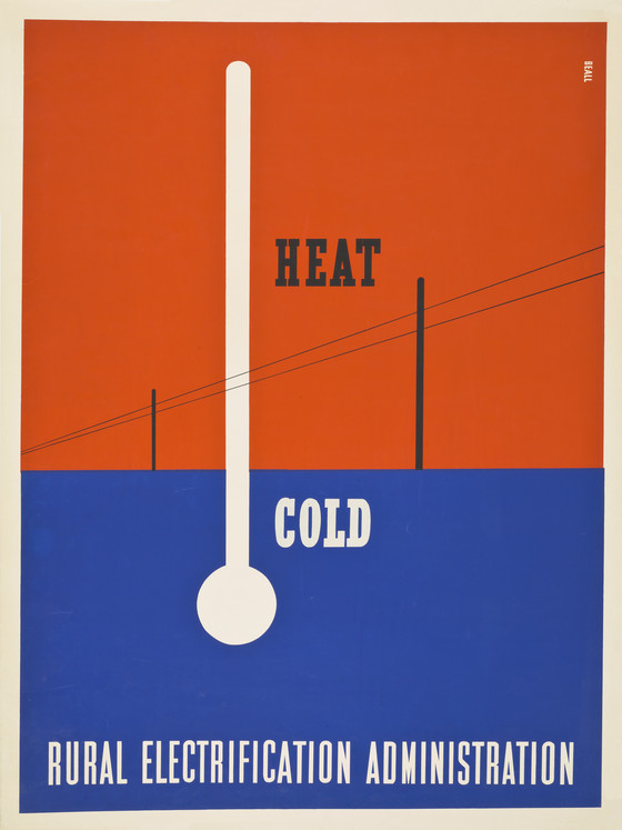
A landmark in American graphic design, Lester Beall’s work for the Rural Electrification Administration (REA) employed innovative European techniques to capture the practical modernity of the agency’s progressive mission. In 1937, Information Officer Bill Phillips commissioned Beall to publicize the REA’s efforts and convince citizens of electricity’s benefits. While wealthy Americans had electrified their homes as early as the 1870s, much of the country remained without power well into the twentieth century, a trend that seemed unlikely to change as Depression-era energy companies shied away from risky ventures. A New Deal program created as a division of the Department of Agriculture in 1935, the REA aimed to use federal funding to boost living standards in regions like Appalachia.
Between 1937 and 1941, Beall completed three series of screenprint posters for the organization, each comprised of six designs. For the first, which included this poster, Beall designed stark black and white icons to represent basic amenities such as heat, light, radio, running water. He contrasted these pictographs against flat two-color grounds, recalling Constructivist graphics in his use of asymmetric layouts, diagonal lines, and arrows to convey movement and energy. His sparse text reflected both his reductivist aesthetic and the minimal reading skills of his intended audience. In series two (1939) and three (1941), he added first photomontage and then bright red, white, and blue patterns to encourage citizens’ patriotic support for the bright promise of an electrified future.
The widely acclaimed first series cemented his reputation at home and abroad. In 1937, the New York Times praised Beall’s ability to "reduce to the simplest graphic terms the symbols necessary" to make his point. That same year, the series was exhibited at the Museum of Modern Art, an unprecedented honor for an American graphic designer. Beall was subsequently profiled in leading publications including New York’s PM (1937), the German Gebrauchsgraphik (1938), and the French Arts et Métiers Graphiques (1938).
Steinberger, Staci, Associate Curator, Decorative Arts and Design, 2021
More...